Amulet Case Study
Description
Amulet is a thoughtfully curated concept store that celebrates the beauty of discovery through a refined selection of antiques, artisan-crafted objects, and luxurious stationery sourced from Japan. Each piece reflects a deep appreciation for craftsmanship, history, and quiet elegance, blending traditional techniques with timeless design.
Role: Designer, branding
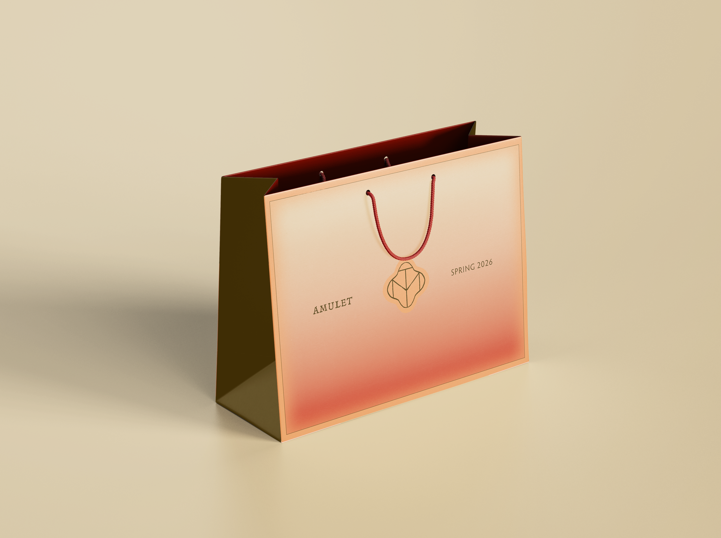
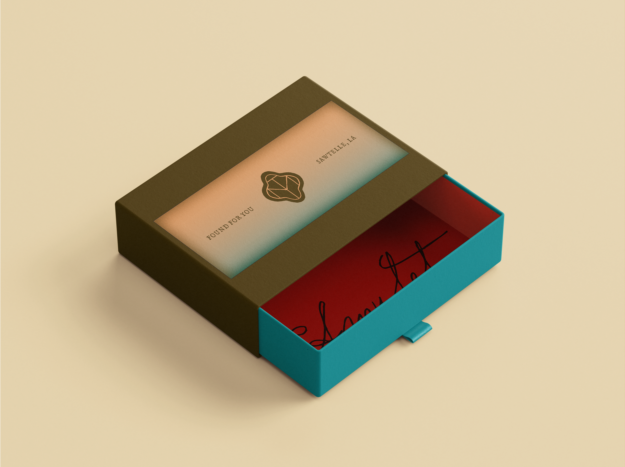
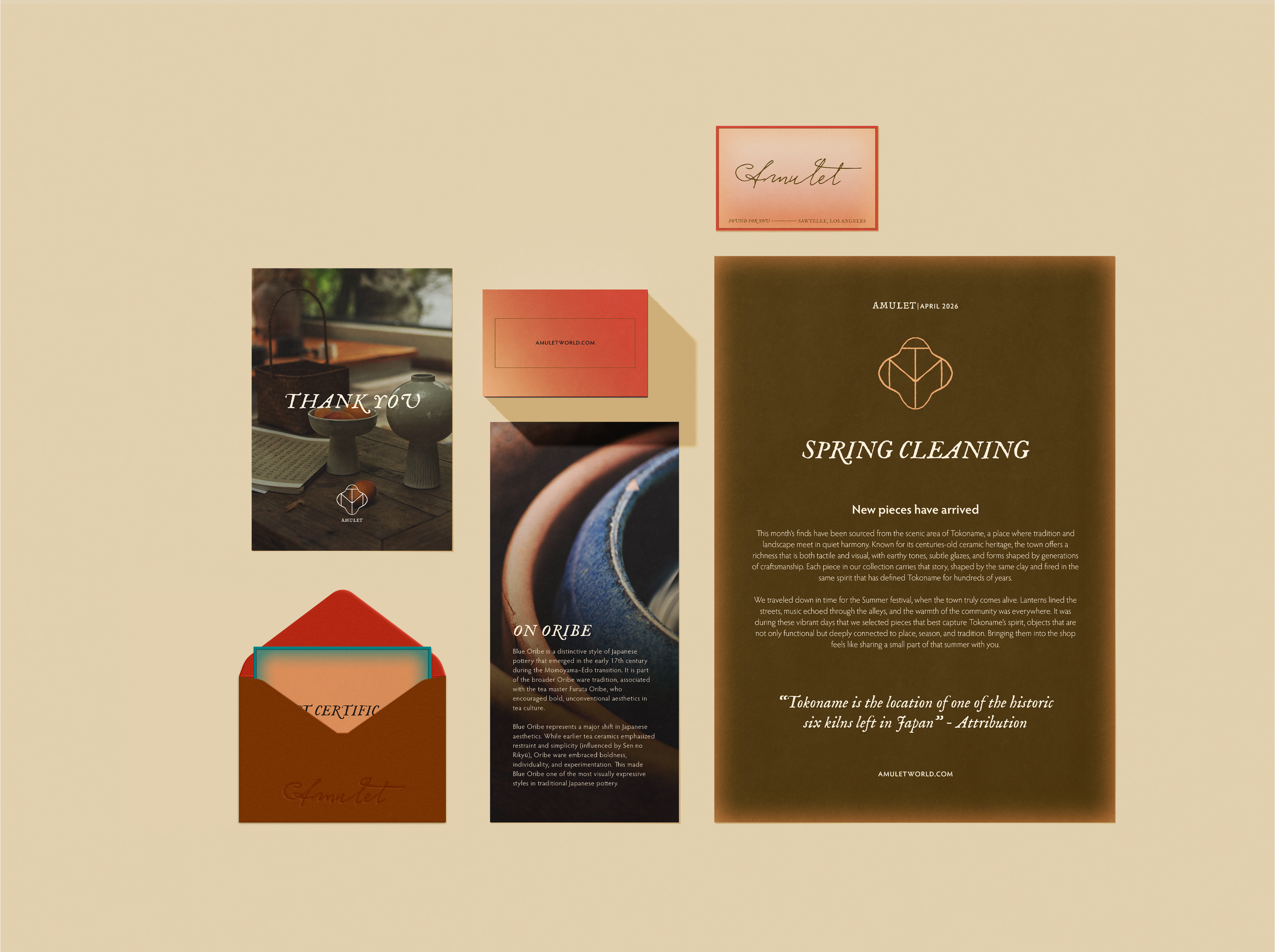
Deliverables: Logo, packaging, inserts, print media, digital marketing, visual guidelines
Approach
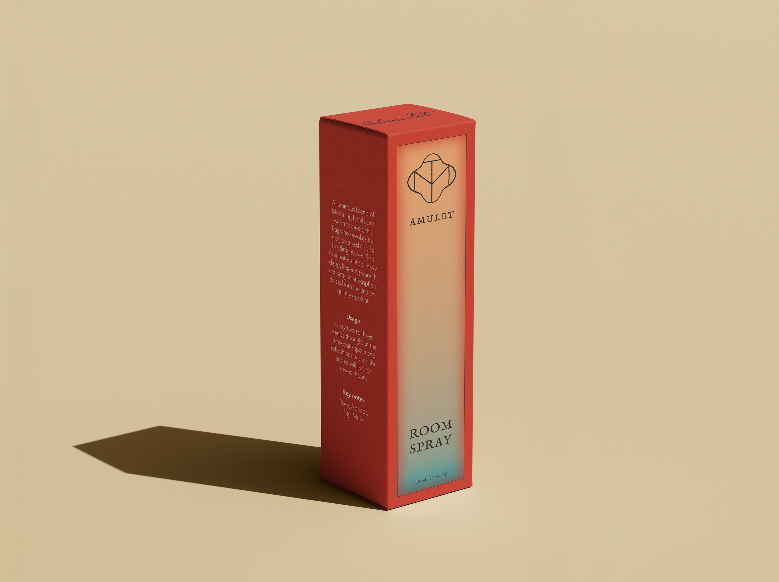
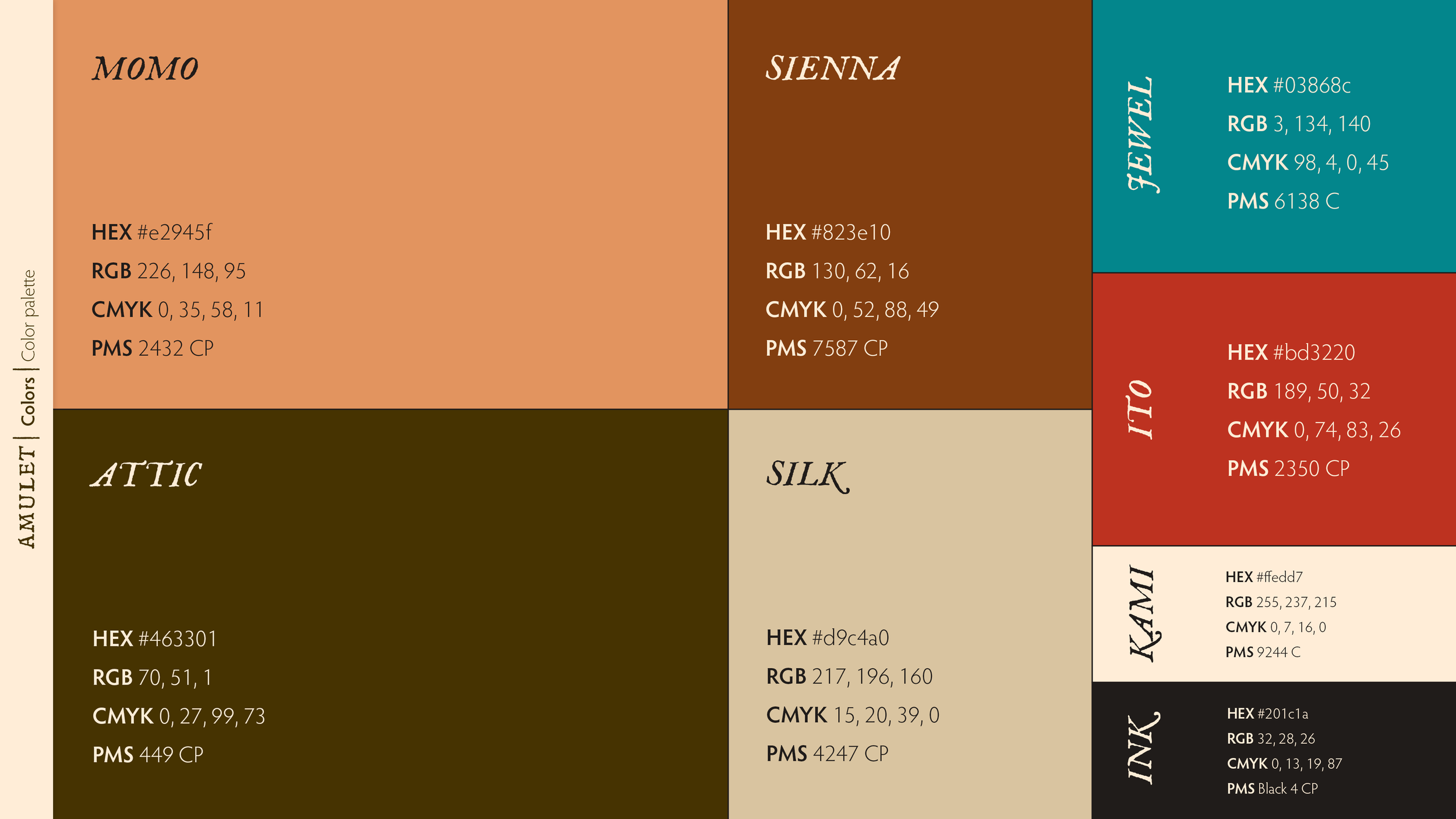
Starting with the idea of discovery, vintage, and Japanese motifs, I created a palette reflecting the feeling of finding something wonderful. The peach pays homage to Japanese momo coral, while the deep khaki evokes the feeling of finding a gem tucked away in an attic. Soft gradients with worn edges were inspired by the faded silks that have been stored for years. All together, Amulet’s color and design story is one of quiet joy and discovery, with a nod to the past.
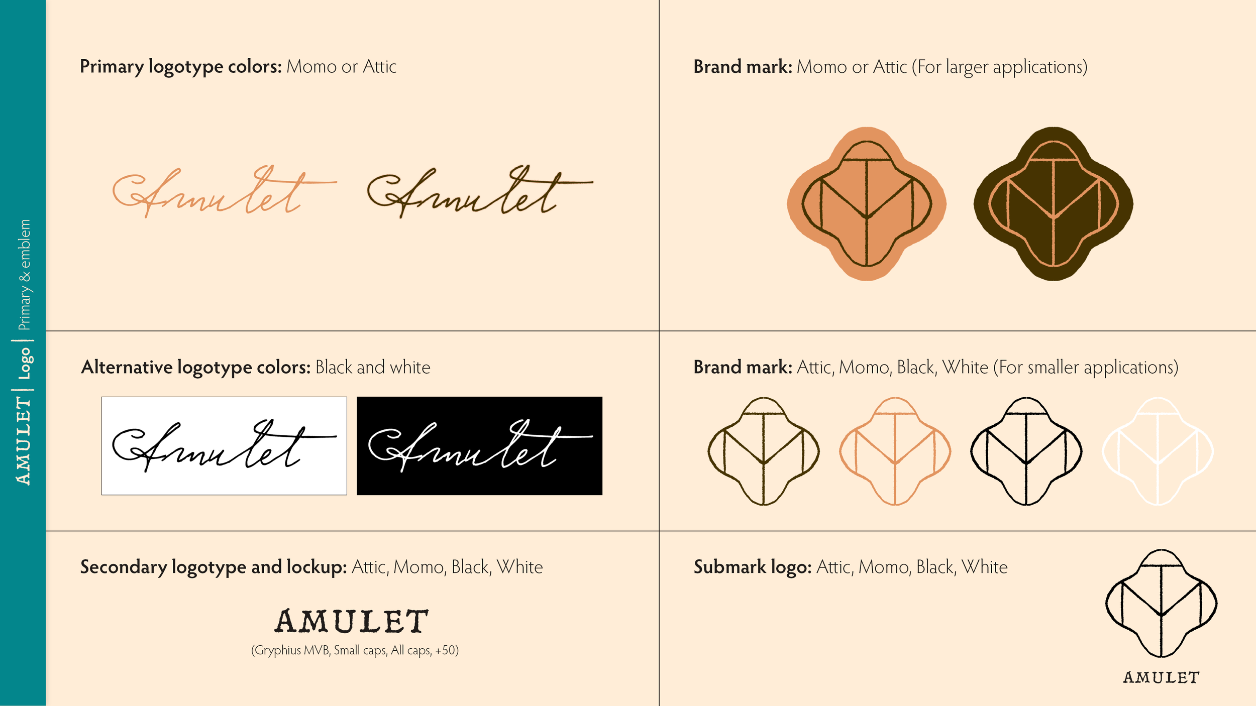
The brand mark uses the letters of the name to create a symbol that reads both traditional and new. The shape evokes the knots of the art of mizuhiki, the artform of creating decorative knots from washi paper.

UI/UX
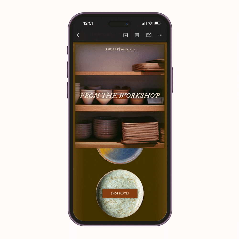
Mobile e-commerce UX
Amulet is a concept store that aims to provide an immersive storytelling experience designed to help customers explore meaning through the store’s product offerings.
Problem
Most mobile shopping experiences prioritize efficiency but lack emotional engagement, especially for products tied to meaning or identity.
Users often:
Browse quickly without forming a connection to products
Experience visually generic interfaces
Lack context behind the items they purchase
Goal
Design a mobile retail experience that:
Combines clear shopping functionality with immersive storytelling
Encourages users to explore products intentionally
Creates an emotional connection between user and object
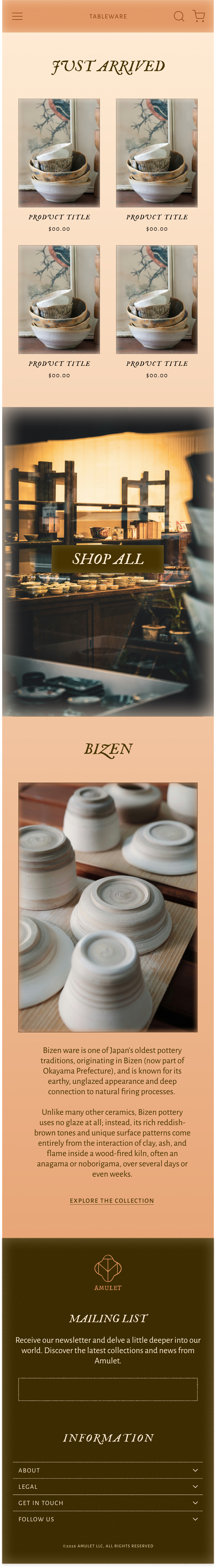
Final UI design concepts
Immersive visual priority
Full-screen imagery allows products to feel intentional and emotionally engaging.Minimal interface
Reduced UI elements to avoid overwhelming users and maintain focus on products.Structured shopping flow
Maintained familiar e-commerce patterns (grid, cart, checkout) for usability.Story-driven product detail
Introduced a “meaning” section to differentiate from traditional retail experiences.
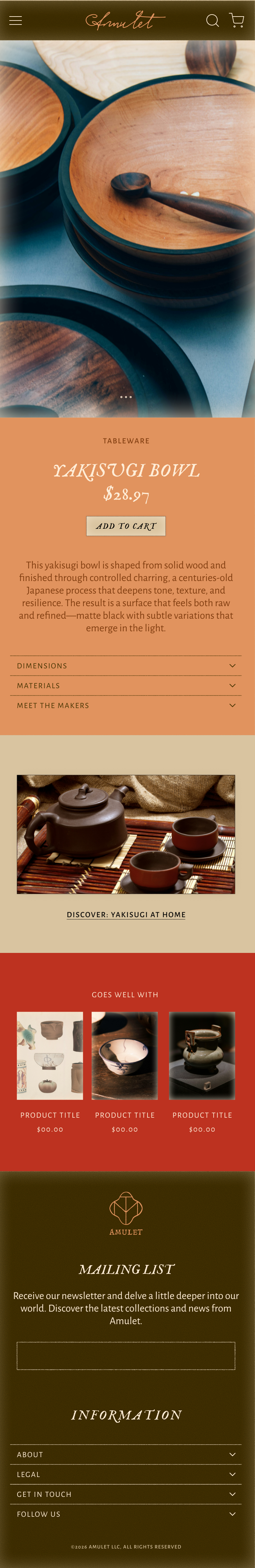
Product page - details
The product page was designed as the core conversion point, balancing storytelling with clarity:
Large product imagery for visual impact
Minimal but meaningful description
Expandable details section and featured article to provide further context